In what ways does your media product use, develop or challenge forms and conventions of real media products?
There are various aspects of my products that both conform to various media and genre conventions, but also parts that are unconventional. My music video is probably the product that fits most with genre conventions. There are several reasons why this is so.
The video created by my partner and myself has been designed for music of the psychedelic genre. This genre is quite specific in its sound, appearance, message and themes, and so we had to try and bring these aspects into our video while at the same time trying to keep it unique and original. One of the key features of the video that fits the conventions of this particular genre is the use of psychedelic imagery and colour. Using imagery such as coloured mushrooms, slowed down and distorted faces and chaotic scenes at the dinner table we were able to strongly represent the psychedelic aspects of the video, while, at the same time, offering the audience some fresh and exciting to view.
The themes we incorporated into the video are also highly conventional in relation to our chosen genre. By inter-textually referencing the film, and book, 'Alice in Wonderland' we were immediately able to show the viewer what genre of music video they are viewing. The film 'Alice in Wonderland' has bad much reference throughout the years in both psychedelic music and visual art. In using an inter-textual reference in our video we have immediately created a conventional element, even if the rest of the video were unconventional. This is because many music videos, both new and old, incorporate an inter-textual reference, whether it be from a film or another music video. It is a common occurrence that directors refer to other texts in their own.
By visually hinting at underlying themes of insanity, madness and disorder we were able to make the video conventional to the genre in this respect as well. There are often themes of insanity and madness in psychedelic films and artwork, which we attempted to bring out in our own video.
Although most aspects of my music video are conventional either to the genre or as a music video in general the same cannot be said for either of my print production products.
Both my album cover and magazine poster challenge, in some ways, most of the conventions of visual art for music products. A prime example of this is the use of a completely white background for both my front album cover, and for the magazine advert. This is very rarely seen on such products as, for the most part, it appears to be visually bland and uninteresting. However, i decided to use a white background as it allows my image to stand out and look visually a lot stronger. It also holds further connotations of barrenness and gives the product an ironically clinical feel.
I have further challenged what would be viewed as normal with my album cover in my lay out. Instead of having the artist name at the very top of the cover i decided to put it in the bottom left corner, in the format of a bar code. It is usually rather unusual to find an album cover that does not had the artists name at the top or as the main feature of the cover its self. I decided that in challenging this convention my cover is made that bit more interesting visually.
Despite being rather unconventional as designs in general the colour scheme in both my magazine advert and the album art designs are in keeping with the forms and conventions of psychedelic art. The use of colour is not dissimilar to optical art and other forms of psychedelic art. The colour paring creates a mild optical illusion, adding further depth to the images. In addition to this the use of surreal imagery is also typical of this style of art, further strengthening the impression of psychedelia it gives the viewer.
Even though there are aspects of my products that are unconventional and unusual when put together (both video and print productions) they are, on the whole, conventional. The combination of both original and conventional aspects allows my products to be both original and unique whilest at the same time making it obvious what they're about, who they're aimed at and how they should be interpreted.
Wednesday, 13 April 2011

Tuesday, 12 April 2011
Coursework Evaluation : Question 3
What have you learned from your audience feedback?
Audience feedback
View more presentations from DanNorgrove.
 |
| This is an example of one of my questionnaires, designed on 'Survey Monkey', that has been filled in. |
Sunday, 3 April 2011
Coursework Evaluation : Question 2
How effective is the combination of your main product and ancillary texts?
The audience demographic for my media products is that of an alternative/hippy style. Due to this i had to try and create a surreal, psychedelic feel for both my video and print production, as well as conveying social statements about young people and the current state of modern society, in order to represent the ideals of the artist and to create something that appeals to such a niche audience.
I have deliberately given my outer album art and poster designs a very different look to that of my video. Despite this there are things that link my products. These links are either stylistic or come in the form of underlying themes. Both my video and all aspects of the digipack show a very similar representation of the artist i have chosen to promote. Although this is not immediately obvious, perhaps visually, it can become apparent when one contemplates the message intended in both products. The idea of hedonism plays quite a prominent role in my video, as well as rebellion, going against the norm (or the system). Social commentary, which is also a strong theme in both my video and digipack, fits which the ideals and views of the artist, linking the products together in meaning. Although the video and outer album designs contrast visually they work together, subtly, in the message they carry.
The two interior pages of the album booklet are both stills from the music video. I chose to use still images from the video because it links the two products together visually, and gives the audience a better idea of what the artist represents. By placing these images on the inside covers my album design still looks unique, original, interesting and independent from the video, showing a variety of ideas, whilst linking the products together. The use of stills from the video also acts as a good advertisement and marketing scheme as those purchasing the CD are likely to have either watched the video or will wish to view it after purchasing the album.
Both my video and print productions follow various conventions of the psychedelic genre. This is done through use of colour, surrealism and theme in the video. The fonts and themes of my print productions also connote psychedelia and surrealism. The use of colour, both in the poster design and the album design, plays an extremely important role. Using colours at opposite ends of the spectrum to each other (or colours that clash) i was able to create something eye catching and visually interesting. By placing my image onto a completely white background the viewers eye is drawn towards it. The use of a barren back drop for my image challenges the usual conventions seen in both album design and posters. More often that not the background colour/image is either brightly coloured or uses dark shades such as black and grey.
Some may find that the lack of direct visual similarity to discredit the texts as a collective product. Others may be of the opinion that this strengthens them as it adds variety and originallity. it is my view that the album and poster art complement the video well.
The audience demographic for my media products is that of an alternative/hippy style. Due to this i had to try and create a surreal, psychedelic feel for both my video and print production, as well as conveying social statements about young people and the current state of modern society, in order to represent the ideals of the artist and to create something that appeals to such a niche audience.
I have deliberately given my outer album art and poster designs a very different look to that of my video. Despite this there are things that link my products. These links are either stylistic or come in the form of underlying themes. Both my video and all aspects of the digipack show a very similar representation of the artist i have chosen to promote. Although this is not immediately obvious, perhaps visually, it can become apparent when one contemplates the message intended in both products. The idea of hedonism plays quite a prominent role in my video, as well as rebellion, going against the norm (or the system). Social commentary, which is also a strong theme in both my video and digipack, fits which the ideals and views of the artist, linking the products together in meaning. Although the video and outer album designs contrast visually they work together, subtly, in the message they carry.
The two interior pages of the album booklet are both stills from the music video. I chose to use still images from the video because it links the two products together visually, and gives the audience a better idea of what the artist represents. By placing these images on the inside covers my album design still looks unique, original, interesting and independent from the video, showing a variety of ideas, whilst linking the products together. The use of stills from the video also acts as a good advertisement and marketing scheme as those purchasing the CD are likely to have either watched the video or will wish to view it after purchasing the album.
Both my video and print productions follow various conventions of the psychedelic genre. This is done through use of colour, surrealism and theme in the video. The fonts and themes of my print productions also connote psychedelia and surrealism. The use of colour, both in the poster design and the album design, plays an extremely important role. Using colours at opposite ends of the spectrum to each other (or colours that clash) i was able to create something eye catching and visually interesting. By placing my image onto a completely white background the viewers eye is drawn towards it. The use of a barren back drop for my image challenges the usual conventions seen in both album design and posters. More often that not the background colour/image is either brightly coloured or uses dark shades such as black and grey.
Some may find that the lack of direct visual similarity to discredit the texts as a collective product. Others may be of the opinion that this strengthens them as it adds variety and originallity. it is my view that the album and poster art complement the video well.
Friday, 11 March 2011


Wednesday, 9 March 2011
Print production - CD Cover (front)
 |
| This is the album art for the front of the album by my chosen artist. |
Print production - Advertisement
 |
| This is the poster i have designed to advertise a new album for the band i have chosen to create my music video for. |
Monday, 28 February 2011
Wednesday, 9 February 2011
Tuesday, 7 December 2010
Monday, 6 December 2010
Monday, 22 November 2010
Profile of Self

Tuesday, 16 November 2010
Narcissism
–noun
1. inordinate fascination with oneself; excessive self-love; vanity.
2. Psychoanalysis . erotic gratification derived from admiration of one's own physical or mental attributes, being a normal condition at the infantile level of personality development.

1. inordinate fascination with oneself; excessive self-love; vanity.
2. Psychoanalysis . erotic gratification derived from admiration of one's own physical or mental attributes, being a normal condition at the infantile level of personality development.

Sunday, 31 October 2010
Costume and Props (Archive)


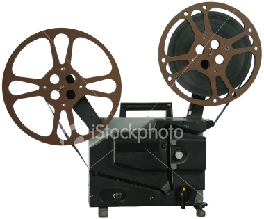
The film reel is a crucial prop for our video, as the whole theme revolves around it. Although it is not featured frequently it is the prop that establishes the whole story line.


Saturday, 30 October 2010
Explanation of narrative and structure.
We intend to have several smaller story lines running through our main one. This, we hope, will help captivate the audiences attention and perhaps make them wish to watch the video more than once, in order to notice the smaller details.
Instead of having a linear plot line we intend to mess with the order of things, in doing this the audience is not completely aware of what is happening right until the end of the video. We hope that this will encourage them to watch it all the way through, and also make them pay closer attention and think about what it is they are watching.
Our video is going to begin in the 'East Anglian Film Archives' and then, after having part of the scene from there it will cut to one of the sub story lines (either filmed at the Cathedral, at my house, or at peters house). Following this it will then cut back to more footage taken at the archives. This structure will repeat up until the end of the video. By doing this nothing in the video stays the same for long, making it more visually interesting and holding the viewers attention for longer.
Instead of having a linear plot line we intend to mess with the order of things, in doing this the audience is not completely aware of what is happening right until the end of the video. We hope that this will encourage them to watch it all the way through, and also make them pay closer attention and think about what it is they are watching.
Our video is going to begin in the 'East Anglian Film Archives' and then, after having part of the scene from there it will cut to one of the sub story lines (either filmed at the Cathedral, at my house, or at peters house). Following this it will then cut back to more footage taken at the archives. This structure will repeat up until the end of the video. By doing this nothing in the video stays the same for long, making it more visually interesting and holding the viewers attention for longer.


Subscribe to:
Posts (Atom)